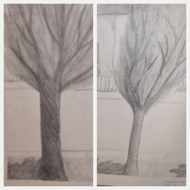
So here a few of the reasons why I really like this drawing. First I figured out a different way to depict trees. Before my drawing of trees looked like this:
Now don't get me wrong, I do like the way I drew the tree in this drawing, but I feel like you can tell I'm a beginner. This is not to say I have advance from a novice stage in the first drawing. All I am acknowledging is that I feel like learned a new technique to drawing an image.
The second thing I like about my drawing is that this is actually me drawing from actual life and not a photo. I took a different approach this time and instead of taking in everything in the scene, I chose to points and made them my constraints. In this drawing my constraints were the two trees. This way I was able to focus on a specific area and draw it in detail without getting myself confused or distracted about the entire scene. This also helped me to understand the scale and position of the objects I was trying to draw.
The last couple of things that I like about my drawing is the journey from beginning to end. I started out first drawing a light outline of the trees and then the fence and I built up from there. When I did this it better helped me to understand what my professors were saying about building up a drawing by adding value to each component. I also learned that a pencil with a dull tip made it easier to create value. The sharper point made my lines heavier and when I tried to use a smudge stick with those types of lines they smudged, but you could still see the lines (which I liked this affect when I did the trees, but when it came to the roof and fronts of the houses it wasn't very affective).
Now for the the things I didn't like and/or feel I need to improve on. I talked with my professors about this drawing, because after studying it a bit I began to question if what I did was really a value study or more of a shading project. Let's take a look at the trees side by side.
Another aspect of this drawing that maybe lacks value is the fence. I personally like the way the fence was expressed in this drawing, but I do understand my professors critique about how some value should have been given to the front side of the individual posts. When I drew the fence I was more concerned with trying to get the fence to look 2 dimensional and not so flat on paper, I feel like I did this, but I could have taken the drawing further by adding more value and tone to front side of the posts.
There are some other places in this drawing that I think I got a little lost with creating value and tone was on the roof and the actual fronts of the houses.
Overall I just think it will take more practice to fully understand and get more skilled at creating value and tone in my drawings. I must say though I am very proud of myself thus far as if you would've shown me this drawing in the beginning of class I would've never believed that was something I did. I am very excited about my progress and am even more excited to see my skills develop even the more.


No comments:
Post a Comment