Friday, December 6, 2013
Deducing The Relationship Between Analytical and Intuitive Thinking
When I think about the relationship between analytical and intuitive thinking I tend to focus on the differences first. I have found that I am more of an analytical thinker, but I also feel that over the years through life and education I have been trained to think that way. As children we tend to lean towards our intuition and what feels right. We are molded by society, our peers, parents and other authority figures to think a certain way. We are taught absolutes and that we shouldn't rely on our feelings, but what facts and figures tell us what is right. This is not to say that analytical people cannot be intuitive and vice versa. The reality is that at some point analytical thinkers use some form of intuition when making decisions. The same goes for intuitive thinkers using analytical approaches at times to arrive to a solution. This very statement for me shows the relationship between these two forms. Each frame of thinking is only enhanced by the other. Because of this I think any good designer; any wise designer learns early on how to navigate between both ways of thinking to boost their creativity and make an idea become reality.
Exhibit Piece
For our final and conclusion to the semester and project we put together an exhibit to display all of our work and the many iterations that came from a song.


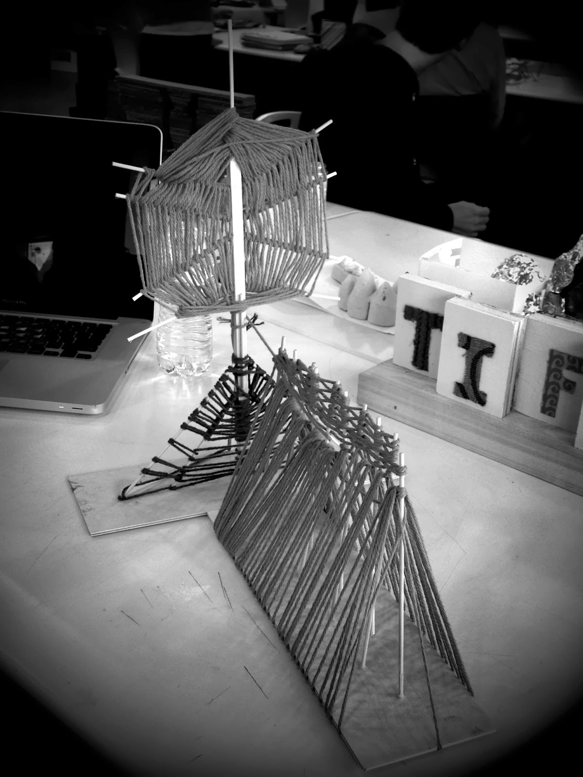
How did I arrive to this point? After completing my dance and the first wooden draft to interpret my dance we were asked create a structure out of wood using at least one type of joinery. The vertical plane with the green string wrapped around it was what I decided to focus on. Not only was it inspired by my favorite part of the dance, I also liked the way I placed the sticks and the space that they actually took up.
Because I am such a planner and an analytical thinker I kept sketching and making different blue prints to try and figure out what I wanted to do and how to execute it. I finally came up with an idea that involved cutting the wood into these saw tooth planks and some how joining them together and staining them to get this dramatic chevron pattern. Well, after much editing and playing around with other ideas of inlaying the wood, making dowels to connect the wood, and even staining the individual pieces black and white, I finally came up with following end result.


 As you can see some of the design choices that I talked about above did not make it in to the final creation, but I am very pleased with my results. After speaking with Prof. Mendoza and another student I decided to take their advice and just stain the wood so as to only enhance the grain. I think this was a smart decision. Because of all the movement and shapes that the saw tooth planks create I believe adding color would have taken away from the visual aesthetic of this piece. From the side your eye puts together a chevron pattern on its own. I find it interesting that I did not have to be so literal and forcing the viewer to see a chevron pattern and that due to the way I placed the wood a chevron pattern is suggested, but the viewers eye and mind make the idea an absolute. The other view I like in the piece is the areal view. The way that the wood ends point to the center and direct your eye to that focal point is a dynamic that I hadn't originally planned for, but am glad that it came to life. I thought it was fortuitous that in the previous post "Turning a Song into 3D Space" I talked about how in the song I enjoyed the tribal-like beats the percussions made in the song. When looking at this piece from an areal view it reminds me of something tribal, even Aztecan. The type of joinery that I ended up using was dado that I created by cutting the grooves into the base for the planks to slide into.
The last iteration of the song I danced to was to create a pattern and have it printed on fabric.

The design I created above was filled with a lot of skepticism at first, but I decided to go on intuition and once again, I am very pleased with how well the pattern printed on the fabric. The one thing I would have like to have seen was maybe making the print itself darker. After much editing I just couldn't figure out how to get my brush strokes darker using Adobe Illustrator, so I settled for this. I think choosing a more limber fabric helped with making the pattern stand out even the more. To present this fabric for my exhibit I thought draping it on a body form would be the most appropriate considering the song, dance, pattern design, and texture of the fabric itself.


How did I arrive to this point? After completing my dance and the first wooden draft to interpret my dance we were asked create a structure out of wood using at least one type of joinery. The vertical plane with the green string wrapped around it was what I decided to focus on. Not only was it inspired by my favorite part of the dance, I also liked the way I placed the sticks and the space that they actually took up.
Because I am such a planner and an analytical thinker I kept sketching and making different blue prints to try and figure out what I wanted to do and how to execute it. I finally came up with an idea that involved cutting the wood into these saw tooth planks and some how joining them together and staining them to get this dramatic chevron pattern. Well, after much editing and playing around with other ideas of inlaying the wood, making dowels to connect the wood, and even staining the individual pieces black and white, I finally came up with following end result.


The last iteration of the song I danced to was to create a pattern and have it printed on fabric.

The design I created above was filled with a lot of skepticism at first, but I decided to go on intuition and once again, I am very pleased with how well the pattern printed on the fabric. The one thing I would have like to have seen was maybe making the print itself darker. After much editing I just couldn't figure out how to get my brush strokes darker using Adobe Illustrator, so I settled for this. I think choosing a more limber fabric helped with making the pattern stand out even the more. To present this fabric for my exhibit I thought draping it on a body form would be the most appropriate considering the song, dance, pattern design, and texture of the fabric itself.


Thursday, December 5, 2013
Journey Through Campus
The following is my journey not only through campus, but just my day in general. Enjoy!
Monday, November 18, 2013
Bell Tower and Page 101


This was an in class drawing exercise. I liked this because it helped me to understand a bit better about guidelines. I think my drawing came close to what was in the book. I was off with centering and some picture details. The one thing I didn't like about this exercise was having to keep starting over with each square. I think I would've done better had I been able to continue the drawing in one sitting as opposed to having to keep starting from the beginning with each drawing. I think doing that increased the possibility of me making mistakes or missing details.
Monday, October 28, 2013
Turning a Song into 3D Space
To start, the song I chose was "Tip Toe" by Tamar Braxton. I chose this song not only because I really like it, but I love the instruments that are in the song. The percussion in this song sounds kind of tribal to me and I love the range of her voice in the song. She also uses her voice to make emphasis on certain phrases in the song. For example there is a line where she says "Cause I don't want my business t be at my neighbor's door, and I don't want my business on the Wendy Williams Show!" I also thought this line was funny considering who Wendy Williams is (a celebrity news gossip). This is definitely one of those songs that when you hear it you can't help to move. Here is a link to the song below.
"Tip Toe" - Tamar Braxton
So I made up a dance to this song. I would describe the dance as very structured with every movement having a purpose to express that part in the song. Here is the dance.
Dance
As you can see I used neon lights on my wrist, ankles, and head to better focus on the space that I was occupying while doing the dance. As for it being shot in the dark there is a reason for that as well; actually two. The first and obvious reason is because I wouldn't be able to see the lights. The second reason is more of a vain one. I enjoy dancing better when I'm in my living room and no one's watching but my dog. I'm so glad animals don't judge!
After doing my dance and reviewing it I came up with a space that occupied a perpendicular plane. I could explain what I did, but I have pictures!


UPDATE: To follow up with this piece, the whole thing fell apart literally. I decided that instead of taking more time to put it back together and weave the string all over again, I would just move on to the next iteration. This next iteration is discussed more in the post "Exhibit Piece".
Friday, October 25, 2013
More Inspiration
Found this video on YouTube and it's so amazing. A must see; check it out!
Quixotic Fusion: Dancing with light
Quixotic Fusion: Dancing with light
Tuesday, October 22, 2013
Music in Pictures
We were asked to pick our favorite song. This song had to be one that we would listen to over and over again. It should be one that spoke to us and would stop us in our tracks if we heard it in the street. The song I chose for this project was "Beautiful" by Blackstar feat. Mary J. Blige and here is the link below:


Next we were asked to draw 25 squares on a piece of paper and take a minute (graciously timed by Prof. Mendoza herself) to draw whatever the music was making us feel. Here are some of the images I drew below.
After that we were asked to take some pictures that expressed our song and make a collage.
I was asked why I chose to place my photos on this particular grid pattern and honestly it was because the small pictures I drew were on the same type of grid.
My second iteration of my collage is pictured below. I needed something big to place my pictures on because I could not figure out how to print my pictures out smaller than 4x6. Most of the pictures I took were of flowers from Duke Gardens in Durham, NC but I also wanted some pictures of actual people as well. I decided to go to Southpoint mall also in Durham,NC and take pictures of couples. I don't have a picture of my second iteration as I pretty much deconstructed it before I realized I had no photo of it. It was basically a tri-fold poster board with my pictures and drawings arranged in it.
My third iteration is pictured below. I wanted something with a little more depth and dimension which is why I chose to create a four sided box.
Wednesday, October 16, 2013
Formal Introductions
I just realized that I have not taken the time to formally introduce myself...Hello!

My name is Tiffani and I'm a 31 female originally from NJ, but was pretty much raised in NC my whole life. I'm a second degree student at UNCG pursuing a degree in Interior Architecture. My first undergraduate degree was in Nursing, which I obtained in Charlotte, NC at Queens University of Charlotte. After obtaining my nursing degree and license I vowed I'd never go back to school for anything ever again, but here I am! I guess that's why they say never say never!
I love nursing and I love taking care of people, but if you were to ask me if I were passionate about it, I would have to tell you no. When I graduated from high school and got accepted to college I knew I wanted to major in something that was not too competitive and something that I would be guaranteed a job once I completed school. The answer to all of that was nursing, and that's what I did. I do not regret going into the nursing field. I appreciate all the knowledge I have when it comes to health and wellness. I am proud of all the skills I have learned over the years and making a difference in peoples lives on a healthcare level. But now I would like to reach people in a different way.
I feel deep down inside I am a creative and artsy soul. I could sit for hours doing arts and crafts and not get tired. I love creating things and working with my hands to build. I remember in college I had to take a "fluff" course and decided to take ceramics. In all my years of school (prior to now) never had I stayed in a studio or classroom until 10 or 11 o'clock at night throwing clay. I would put my earbuds in and tune out the world and it would be just me and the clay for hours, and I was at peace every minute of it. I love structures and I love to learn about the different materials used to make them. I love to feel the different textures of different materials. I could spend hours walking around a museum of art just studying and learning about the different artists, their pieces of work, and their muses.
Because of all this and more is why I find myself embarking on a new path in life. I not only want to learn the above things and more, but I want to be well versed in these areas as well. I want to learn the language that goes along with this medium of knowledge and skill; I want to be apart of that world. And so here I am, back in school at 31 years old breaking my vow to do something I said I wouldn't to chase my dreams and relish in my passion.
Value Drawing
I must say that the whole value drawing studies are proving a bit challenging for me. But with much more practice I believe I will get a handle on it. For now though, the picture below shows what I feel to be my best value drawing.
 So here a few of the reasons why I really like this drawing. First I figured out a different way to depict trees. Before my drawing of trees looked like this:

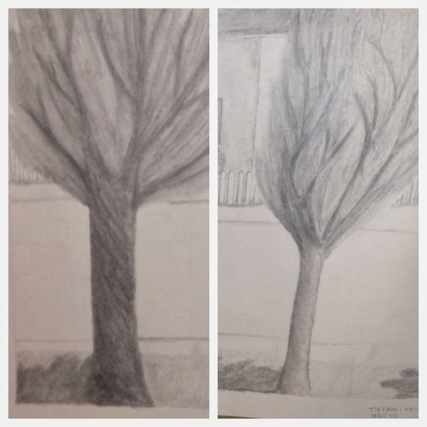
Unfortunately the picture here is not very clear of the drawing, but after my discussion with my professors I do agree that the tree on the right shows a better example of value drawing (as far as the tree trunk portion) than the one on the left. However, the reason why I did the tree on the left a bit darker than the one on the right was because it was actually darker (as far as the actual bark and the lighting on the tree). Also I want to add that the tree on the left was the first one I drew. All in all, I think I'm just in love with the technique I used to draw the trees!

Another aspect of this drawing that maybe lacks value is the fence. I personally like the way the fence was expressed in this drawing, but I do understand my professors critique about how some value should have been given to the front side of the individual posts. When I drew the fence I was more concerned with trying to get the fence to look 2 dimensional and not so flat on paper, I feel like I did this, but I could have taken the drawing further by adding more value and tone to front side of the posts.
There are some other places in this drawing that I think I got a little lost with creating value and tone was on the roof and the actual fronts of the houses.
Overall I just think it will take more practice to fully understand and get more skilled at creating value and tone in my drawings. I must say though I am very proud of myself thus far as if you would've shown me this drawing in the beginning of class I would've never believed that was something I did. I am very excited about my progress and am even more excited to see my skills develop even the more.
Now don't get me wrong, I do like the way I drew the tree in this drawing, but I feel like you can tell I'm a beginner. This is not to say I have advance from a novice stage in the first drawing. All I am acknowledging is that I feel like learned a new technique to drawing an image.
The second thing I like about my drawing is that this is actually me drawing from actual life and not a photo. I took a different approach this time and instead of taking in everything in the scene, I chose to points and made them my constraints. In this drawing my constraints were the two trees. This way I was able to focus on a specific area and draw it in detail without getting myself confused or distracted about the entire scene. This also helped me to understand the scale and position of the objects I was trying to draw.
The last couple of things that I like about my drawing is the journey from beginning to end. I started out first drawing a light outline of the trees and then the fence and I built up from there. When I did this it better helped me to understand what my professors were saying about building up a drawing by adding value to each component. I also learned that a pencil with a dull tip made it easier to create value. The sharper point made my lines heavier and when I tried to use a smudge stick with those types of lines they smudged, but you could still see the lines (which I liked this affect when I did the trees, but when it came to the roof and fronts of the houses it wasn't very affective).
Now for the the things I didn't like and/or feel I need to improve on. I talked with my professors about this drawing, because after studying it a bit I began to question if what I did was really a value study or more of a shading project. Let's take a look at the trees side by side.
Another aspect of this drawing that maybe lacks value is the fence. I personally like the way the fence was expressed in this drawing, but I do understand my professors critique about how some value should have been given to the front side of the individual posts. When I drew the fence I was more concerned with trying to get the fence to look 2 dimensional and not so flat on paper, I feel like I did this, but I could have taken the drawing further by adding more value and tone to front side of the posts.
There are some other places in this drawing that I think I got a little lost with creating value and tone was on the roof and the actual fronts of the houses.
Overall I just think it will take more practice to fully understand and get more skilled at creating value and tone in my drawings. I must say though I am very proud of myself thus far as if you would've shown me this drawing in the beginning of class I would've never believed that was something I did. I am very excited about my progress and am even more excited to see my skills develop even the more.
Wednesday, September 18, 2013
The Dialogue Between Two Distinct Spaces
The objective of the following project was to create 2 distinct spaces using 12 skewers and 12 pieces of 4x6 paper. These 2 spaces should have some sort of dialogue between them. Below is my process through this project from beginning to end.


Tuesday, September 17, 2013
Drawing Bottles For The First Time
IARC 110 Visualization Drawing
I must insert disclaimer here: I am not very good at this. I struggled a lot with trying to wrap my brain around drawing the squares, finding the center, and drawing the circles. I might add that my lines aren't very good either. I know the final bottles do not look great, so maybe I should post where I started first.


 So as you will see my drawings will come a long way. Now on to what happens with much practice.
 No, not a bottle, but I wanted to try to draw something with just 2 planes and work with that first. With all the lines my point of view on the paper kept changing so It kind of made it hard to see. Eventually I got it though.

This was a flask of some sort that I found at work. I think it use to have flowers in it. My lines in this one are a little better. My planes are still a bit off, but I just need more practice. I like this one because for the most part my lines are even and I was able to draw the circles somewhat close to scale of the real thing.

Again here I was unable to really draw my lines well to connect the circles and the planes aren't really that great either, but I like how there is some improvement than what I started with.
 This isn't a bottle obviously, but I like the lines of the glass and I wanted to draw it. I figured I could use the same concept as before, but I was unable to fully grasp drawing the base.
Again here I was unable to really draw my lines well to connect the circles and the planes aren't really that great either, but I like how there is some improvement than what I started with.
Subscribe to:
Comments (Atom)